

Originally I didn’t want to pick up the Essie Have a ball collection. After Essie’s Neon 2016 collection, I made a promise to myself that I would never buy an Essie neon collection again. Essie is one of my favorite brands, but many of their older neon collections are horrible. Even when I find them in discount stores, I don’t pick them up! However, when I asked around on Instagram, most people told me that the formulas of these new “Have a ball” shades were pretty decent! So when I saw 4 out of 6 shades, when I was at DM in Germany, they had to come with me. Last week, Zalando suddenly had five shades in stock, including the two that I was missing, so it was perfect!
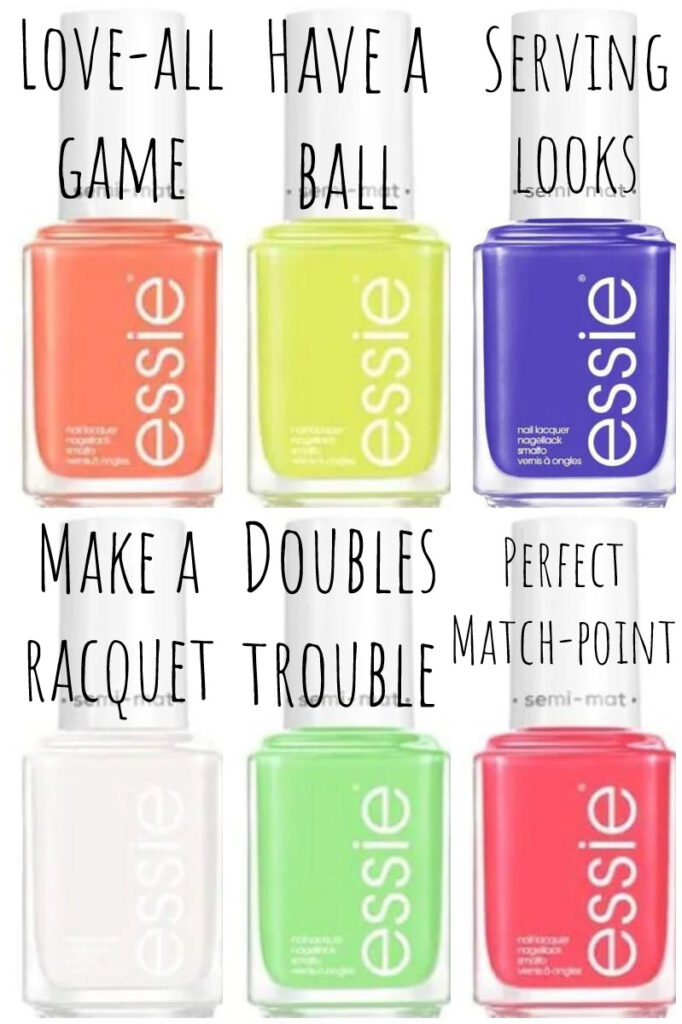
I originally posted the unofficial promo material of this collection over here. The Essie Have a ball collection is a six-piece “tennis-themed” summer collection. I refer to it as “the neon collection”, but I haven’t seen Essie call it that way actually. All 6 shades dry to a semi-matte finish, which is also printed on the cap of the bottle. I made pictures of the shades with topcoat and without, so you can get an impression of what they look like. (I definitely prefer the shades with a layer of glossy top coat though!)
Because this post is quite long, take this link-thingy to make skipping to your favorite shade easier:
- Essie Make a racquet (the white one)
- Essie Have a ball (the yellow one)
- Essie Serving looks (the blurple)
- Essie Perfect match-point (the pink)
- Essie Doubles trouble (the green)
- Essie Love-all game (the coral orange)
Essie Make a racquet

“Make a racquet” was the shade that I was probably the least excited about. To me, white in combination with the semi-matte finish just sounded like a recipe for a horrible formula. “Make a racquet” is definitely the shade in the collection with the most difficult formula, but it is definitely not my worst Essie white! On the first coat, it looks almost like this shade is going to be a milky white (like Essie Waltz), but very streaky. On the second coat it is still kind of milky white, but on the third coat (what I’m wearing here in the swatches) it gets completely opaque. On some nails, I kind of wanted to do a fourth coat, but I didn’t.

The first time I was wearing this polish, I had some bubble issues. I reapplied the polish two times, and waiting a long time in between coats helped a lot. I didn’t hear anyone else about it, so it might just be a me-problem.
Although I think this is the least exciting shade, I do have to say that it fits very well with the tennis theme of the collection. When I was still playing tennis in high school, white was always a big part of my outfit!
Essie Have a ball

Have a ball is a neon yellow with a green undertone, it is a 100 percent match with a tennis ball. I received a lot of mixed reactions when I shared this shade on Instagram. Some people absolutely loved it, and some absolutely hated it. Also when I was at DM, all colors were almost sold out, but of this one, more than 10 were still left.
I wasn’t that sure about this color myself, but it honestly grew on me. If I would see this shade on someone else, I would definitely go up to them to ask what they are wearing.

The formula was surprisingly good. On some nails it covered in two coats, but on most in three. I’ve also tested it over white. It made the shade a little bit brighter, and made the green undertone a little bit less noticeable, which made it more wearable for me. I wasn’t able to capture the difference on camera, unfortunately!

Somehow I expected Essie Have a ball to be closer to my other yellows with a green undertone. However, as you can see in the picture above, Essie Have ball is much darker than all of these shades. I at least expected it to be close to Orly glowsticks, but it is a completely different type of neon yellow. Have a ball could perfectly be the more yellow brother of OPI Pear-adise cove. They are both unusual colors! Unfortunately, I don’t own that many neon yellows, so I don’t have that much to compare it with.
Essie Serving looks

This is Essie Serving looks, the blue/purple of the collection. First thing I noticed when I opened Serving looks? It doesn’t have that horrible smell that some intense blue nail polishes have. It covered nicely in two coats, and I didn’t have any issues with bubbles in this polish.


Compared to the other neon blue/purples that I own, Essie Serving looks is probably the lightest. Orly Synthetic symphony is the most purple, and Essie All access pass is the darkest. Essie serving looks has a much better formula than Essie all access pass, so I’m very happy with this addition to my stash.
Essie Perfect Match-point

Essie describes “Perfect match-point” as a neon pink. I definitely think I can also see some coral undertones in this one, but neon pink is fine with me. Perfect match-point covered on me in two to three coats. Again, I had to be careful to completely let the polish dry in between coats (that’s a good practice anyway), or otherwise, I had to deal with lots of bubbles. Usually, I’m not a pink nail polish kind of girl (unless it’s Essie’s Fiji), but I really like perfect match-point! It’s not the most eye-searing neon pink in my stash, but that’s fine, it’s pretty in its own way.


I was quite surprised that in terms of color Perfect match-point is closest to Essie’s sunday funday. Sunday funday leans a bit more orange. Although I own quite some neon pinks, I don’t own any shades that are comparable to Perfect match-point (but I think there definitely are some dupes for this shade out there).
Essie Doubles trouble

Essie Doubles trouble is a neon green creme. It was one of the shades that were sold out when I picked up the collection in Germany. I definitely think the German ladies were up to something because this shade is so awesome!
Doubles trouble is more pastel than I expected it to be. It requires two to three coats to be completely opaque. Over white it only took two coats. I didn’t see a huge difference in terms of brightness when I applied this shade over white, since it is already pretty bright on its own. In general, I’m really surprised about the opaqueness of this shade.


I was very curious how Doubles troubles would compare to Essie’s Vices versa. Although they are both neon greens, Vices versa contains a bit more yellow and is not that much of a pastel as Doubles trouble. Also, the formula of Vices versa is terrible, it always takes me four coats, even over white.
Essie Love-all game

Essie love-all game is a neon coral. It leans much more to the orange side of the spectrum than perfect match-point. Five years ago, these coral shades were the only color I was wearing during the summer months. Although I still like these types of colors, I grew a bit tired of them. This shade covered on some nails in two coats, other ones required three. The result is so nice in squishy and the formula is definitely better than some other Essie corals that I own.


Love-all game reminded me incredibly of Essie’s serial shopper (from Essie’s neon 2014 collection). I personally think they are incredibly close! Serial shopper is probably one of my most worn Essie shades, but it honestly has a horrible formula. Also, of course, I understand not everyone keeps their polishes from seven years ago, so it was about time Essie released a neon coral with a better formula!

Conclusion & Availability
I’m positively surprised by the Essie Have a ball collection, I didn’t have high hopes at first, but this might just be my favorite Essie collection of this summer! I can’t believe that I was considering skipping this collection. All shades had the same type of formula, they all covered in two to three coats depending on how thick you apply them. The shades perfectly fit into the tennis theme of the collection and let’s be honest, the names are super cute!
The collection contains some shades that are very similar to previously-released Essie shades, but I’m not bad about it, since the formula of the Have a ball collection is pretty much superior to all other Essie neons that I own.
I’ve heard a lot of people complain on Instagram that this collection was very difficult to find. Here on the mainland of Europe, I was able to find them at DM and Zalando. In the UK the collection was already released earlier this year, and in the US this is a CVS exclusive collection (but only in selected CVS stores!). In Canada, the story becomes even stranger. Only “have a ball” (yellow), “Love-all game” (coral orange), and “Perfect match-point”(pink) will be released.
It feels pretty strange, considering it is not even August, but the whole nail polish world seems to be preparing for fall. All I can say is that this is probably the last summer 2021 collection that I will be sharing on my blog!
Oh these do look good and prefer without the top coat. I like the finishes 😀
Haha! It’s definitely a unique finish!
Hi! Do you have the american bottles here? Numbered something in the 1688 range?
And I’m wondering which bottles have what numbers, thanks!
From these ones I only have the European bottles (if you’re looking for those numbers, I put them on the Essie collection page), but I know the US numbers too:
-1687 Make a racquet
– 1688 Have a ball
– 1689 Serving looks
-1690 Perfect match-point
– 1691 Doubles trouble
– 1692 Love-all game