
Here in the Netherlands, it feels like summer is just getting started, but nail polish brands are already releasing their Fall collections. I ordered the OPI Fall 2021 collection from Polishpick.com, which is a US website, but ships to Europe. Polishpick is: a. much cheaper than regular stores and b. they have new collections much faster than in Europe. I will tell a little bit more about my experience, and shipping times, etc. at the bottom of this post.
First, a little bit more about OPI’s Downtown LA collection.
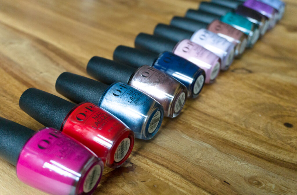
OPI transports its consumers to the contemporary streets of downtown Los Angeles, where big city culture meets modern expansion for the Fall 2021 collection. With 12 colors in four different formulas in hues ranging from trans-seasonal to the dramatic, the DTLA collection offers a versatile palette.
OPI in one of their brochures.
OPI wanted to explore “their own” city of Los Angeles for their 40th birthday and got their inspiration from the LA art scene, modern museums, and ever-changing murals. They also mention that consumers are apparently looking for “trans-seasonal” shades, and that’s why they have included brighter and lighter shades for this year’s fall/winter collection.
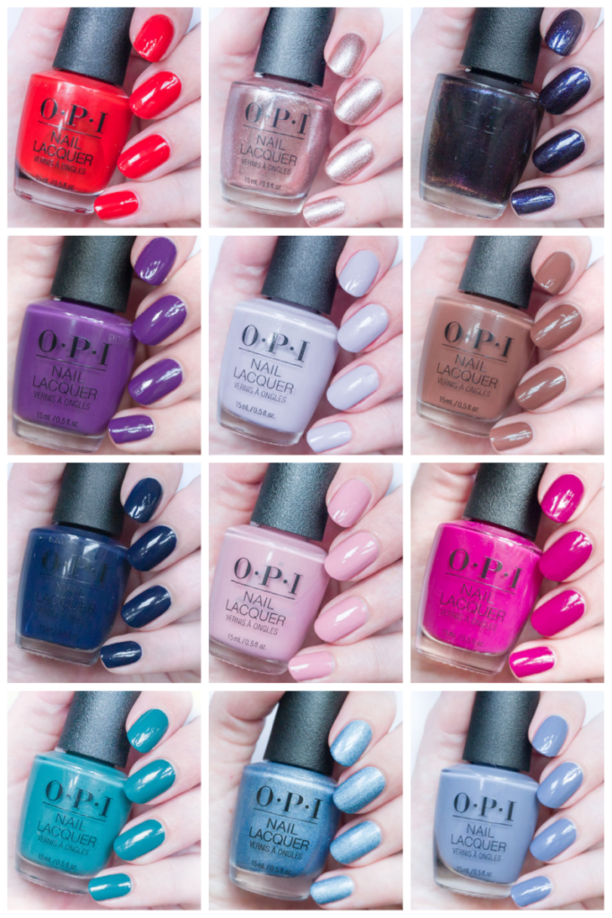
All 12 shades will be available in Nail Lacquer, Infinite Shine, and GelColor, and six will be available in Powder perfect formula (Graffiti sweetie, (P)ink on canvas, 7th & flower, Violet Visionary, OPI (heart) DTLA and Abstract after dark).
I’m still working on doing comparisons and re-swatching these shades, but I have included the pictures that I have in this post. Again, this post has become a bit long with all the comparisons and swatches, so if you are interested in a particular shade, just use these links:
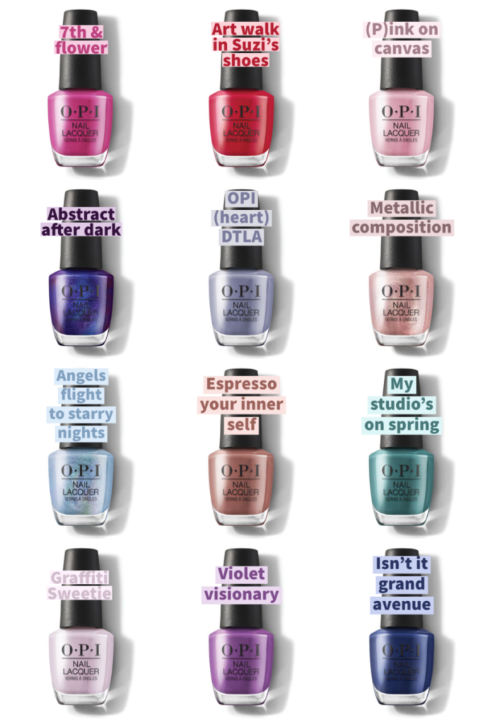
- 7th and flower (magenta creme)
- Angels flight to starry nights (holographic blue)
- Violet Visionary (purple creme)
- OPI <3 DTLA (blue/grey creme)
- Metallic composition (pink metallic)
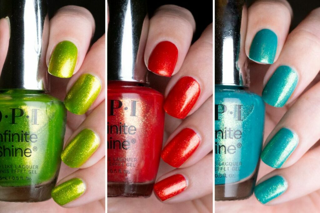
- Art walk in Suzi’s shoes (red creme/jelly)
- Graffiti Sweetie (lilac creme)
- (P)ink on canvas (dusty pink creme)
- Espresso your inner self (Brown creme)
- My studio’s on spring (Green creme)
- Isn’t it grand avenue (Dark blue creme)
- Abstract after dark (dark purple with shimmer)
- Conclusion
OPI 7th & Flower
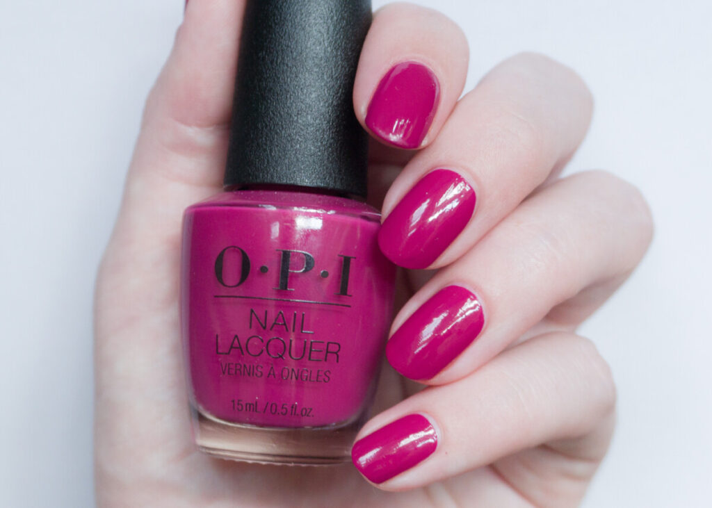
OPI has the following to say about 7th & flower: “Bloom into a magenta motif with this ode to Downtown LA”. I absolutely love these types of colors. I used to own a shade as a teenager similar to this one, and it is probably the only bottle of nail polish I ever finished. Normally I would say this is a true summer shade, but 7th & flower is a little bit darker than a summer magenta, making it suitable for fall and winter. Perfect coverage in two coats, super easy formula.
In case you are wondering: I believe the name is a reference to the crossing of 7th street and flower street in Los Angeles, but “flower” also perfectly fits this color of course.
You can find 7th & flower over here on Amazon (affiliate link).
As an Amazon associate, I earn from qualifying purchases.
OPI Angels flight to starry nights
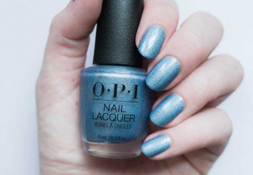
According to OPI, Angels flight to starry nights is a blue holographic shimmer. According to OPI it is one of the standouts of the collection and they describe it as: “Twinkle with a shimmer wash of dusky cool blue”, and apparently it is one of the “trans-seasonal” shades. The formula is very good, two coats were enough for most nails, but some needed a third. The holographic sparkles are very pretty in the sun, but I find that this shade also looks great when there is no sun!
I had to google what “Angels flight” was exactly, but once I did I was like “ahh.. it’s that thing!”, so most people probably know it. Angels Flight is a very short railway going up and downhill (so you don’t have to walk) and is one of the most famous landmarks of Los Angeles.
You can find Angels flight to starry nights over here on Amazon (affiliate link).
OPI Violet visionary
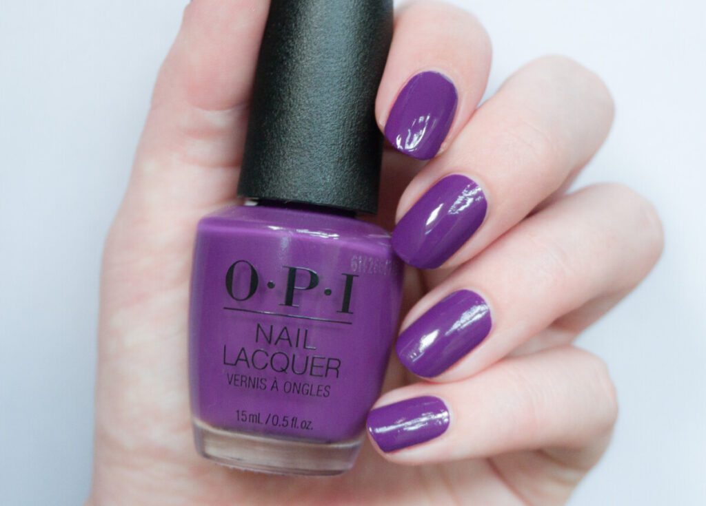
Purple is one of my favorite nail polish colors, but I am also very picky about purples. I want them to be easy to apply, not too dark (but also not too light), and they must not lean too pink or too blue. I was convinced that Violet Visionary would be too light and too pink, however, once I applied it to my nails, I completely changed my mind. This shade is awesome! It has so much warmth and it is dark, but definitely never looks black. Covers in two easy coats.
OPI has the following to say about the color “Hue will be posing in this rich violet crème“. Ha.
You can find Violet visionary over here on Amazon (affiliate link).
OPI OPI heart DTLA
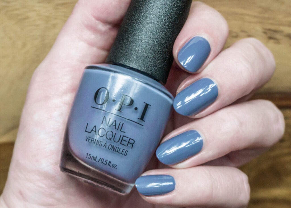
A “deep downtown grey you’ll absolutely fall for” is the official description of OPI heart DTLA. For me, it leans a bit on the blue side for a grey, but that’s just my opinion. It reminds me a lot of Essie’s toned down from the Serene slate 2019 collection, which I recently picked up. Coverage was perfect in two coats. OPI (heart) DTLA dries a bit darker than the bottle. I’ve actually worn this shade twice now. The first time I felt a bit “meh”, but the second time I appreciated this shade a lot! It combines very nicely with brown, but also with cooler tones and black. It basically combines with everything, it’s like jeans but for your nails!
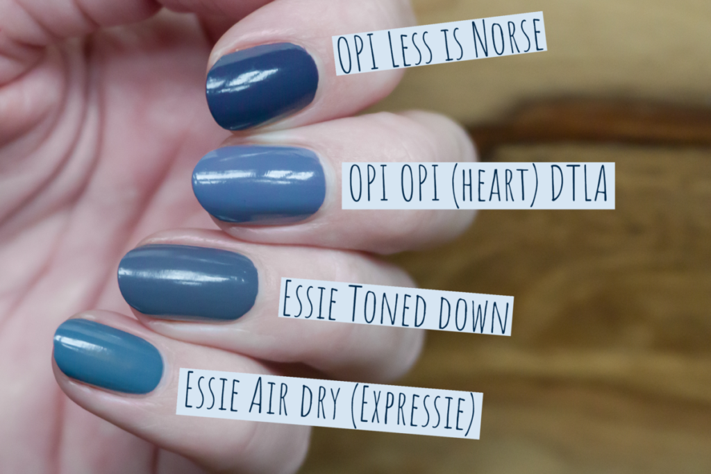
I thought that OPI (heart) DTLA would be very close to OPI Less is norse, but Less is Norse is obviously a lot darker. Also, Essie’s toned down is a little bit darker than OPI (heart) DTLA. Essie Expressie Air dry is very close to OPI (heart) DTLA, but OPI (heart) DTLA is a bit cooler-toned. This comparison just reminded me of how much I love Less is norse and that I really need to wear it again!
You can find OPI <3 DTLA over here on Amazon (affiliate link).
OPI Metallic Composition
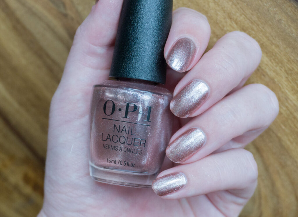
Metallic composition is described as “a shimmery rose gold that’s a sketch of your imagination”. Normally I’m not into metallic shades, but I make an exception for pink ones. Metallic composition is also not your average metallic rose gold, it contains larger glitter particles. I think you can get away with two coats since it is so shimmery, but I still saw my nail peeking through if I looked closer, so I ended up doing three. Because of these shimmers, Metallic composition is a pain to remove (you will still see the glitter particles in my next swatches if you look close).
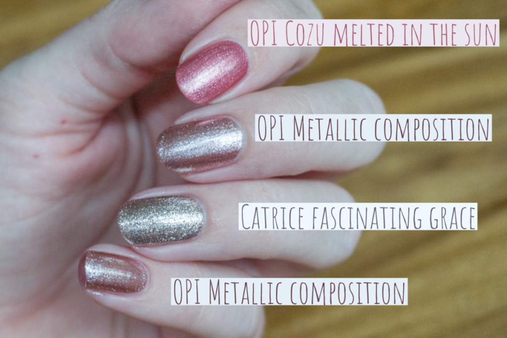
I was curious to see how this shade would compare to “Cozu melted in the sun”. Cozu is pinker, Metallic composition is a more subtle shade of pink. Also, the shimmer in Metallic composition is quite different. I also still own a rose gold from Catrice called “Fascinating grace“. The shade is discontinued but you can still find it online. Compared to Metallic composition, Fascinating grace looks almost silver.
“Intentions are rose gold” is a new shade from the new OPI nature strong collection, sadly I don’t own that shade yet, but it looks a bit browner than Metallic composition. Most shimmer pinks in OPI’s permanent collection have more pearl/metallic/streaky finishes, Metallic composition is unique in OPI’s permanent line.
You can find Metallic composition over here on Amazon (affiliate link).
OPI Art walk in Suzi’s shoes
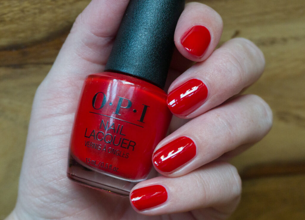
Art walk in Suzi’s shoes reminded me a lot of Emmy, have you seen oscar? from the Hollywood spring 2021 collection. I have to compare them side to side to see the differences. But in terms of formula, they are very similar. “Art walk in Suzi’s shoes” has that same jelly formula. I expect these kinds of reds to be opaque with two coats. Unfortunately, on my longer nails, I still saw the white ends shining through at three coats. Whether it’s worth doing three to four coats, is up to you. What you get in return is a polish with a gorgeous shine, even without a topcoat. However, there are definitely shades of red out there that are opaque in fewer coats.
This is what OPI has to say about “Art walk in Suzi’s shoes”: “A crimson red made for walking into galleries”. On the OPI website is says ‘a cherry red‘. To be honest, it is more a tomato red than a cherry red. Apparently, there is also a big discrepancy between the gel formula of this shade and the nail lacquer formula: the gel formula is even more orange, and the shades do not match at all!
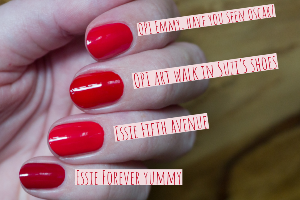
I compared OPI Art walk in Suzi’s shoes to OPI Emmy have you seen oscar, Essie Fifth Avenue, and Essie forever yummy. OPI Emmy have you seen oscar contains a bit more pink, making it a more spring/summer-appropriate shade of red. I expected Essie’s Fifth avenue to be very close, but it is a bit lighter than Art walk in Suzi’s shoes. Also, Fifth avenue doesn’t have that jelly formula. In terms of application, I like ‘Fifth avenue’ much better. Lastly, we have Essie’s Forever Yummy. Forever yummy is the type of red that I think of when I think about a shade of red for fall. It is obviously much darker than the other shades shown in this comparison.
OPI Graffiti Sweetie
Graffiti sweetie is a “sweet crème lilac“. I absolutely adore these types of shades, and I love Graffiti sweetie even more than the lilacs released in last year’s Muse of Milan collection. This shade was very easy to apply, and it covers in two coats. That’s very impressive, considering it is such a light shade! This is definitely one of the big surprises of the collection for me.
OPI says that this is one of the “Gender-fluid” and “trans-seasonal” shades, to me, all shades are gender-fluid, so it’s all fine with me! I definitely get that they are saying it is “trans-seasonal”, it is definitely not a shade that you’d expect in a fall/winter collection. At the same time, this shade combines nicely with dark colors and browns, so it is a very nice addition to a fall collection.

I thought all of these shades would be very close to Graffiti Sweetie. I’m very surprised by the uniqueness of Graffiti Sweetie! OPI Seven wonder of OPI and Purple Palazzo pants are both much warmer. (I think my bottle of Purple palazzo pants might have turned a bit lighter over time.) OPI Galleria Vittorio violet is obviously darker and contains pink shimmer.
You can find Graffiti sweetie over here on Amazon (affiliate link).
OPI (P)ink on canvas
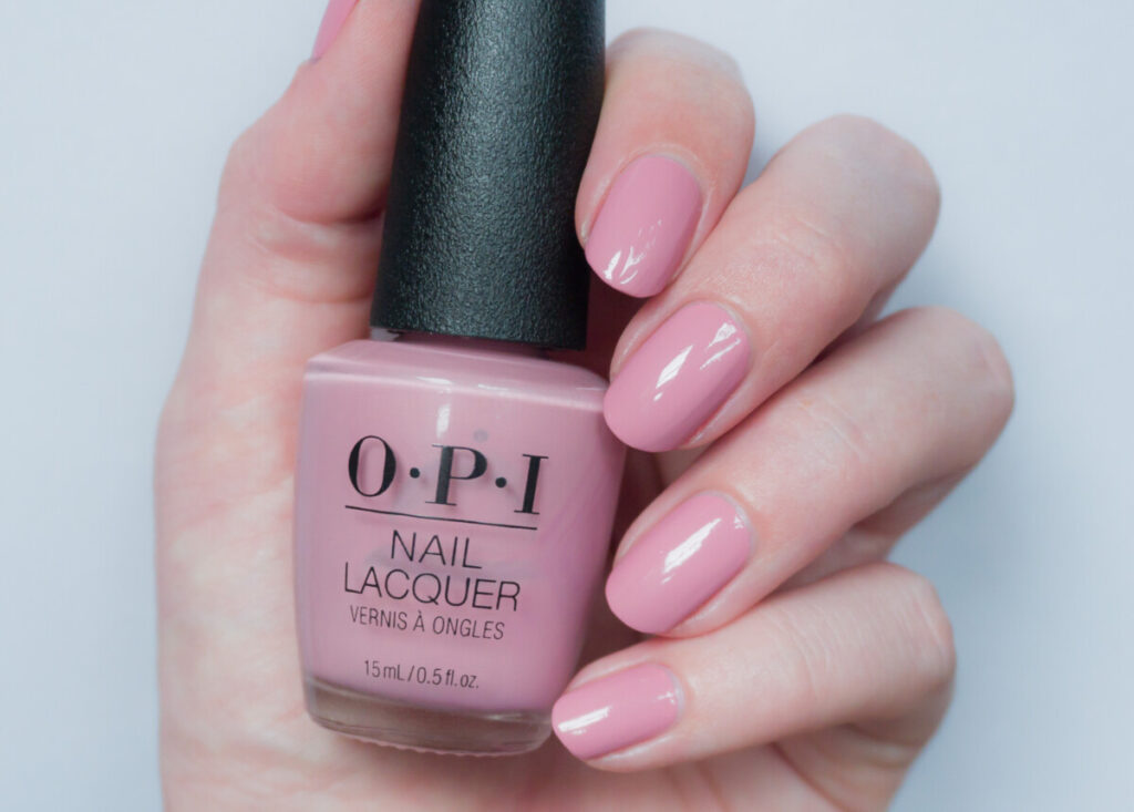
(P)ink on canvas is the other “gender-fluid” and “trans-seasonal” shade according to OPI. It is a pastel crème blush. Also very pretty. At first, it looked like a typical Spring shade to me, but it seems to have a bit of dustiness to it, which makes it very suitable for fall/winter too! Again, the shade had a fantastic formula, covering in two coats.
You can find (P)ink on canvas over here on Amazon (affilate link).
OPI Espresso your inner self
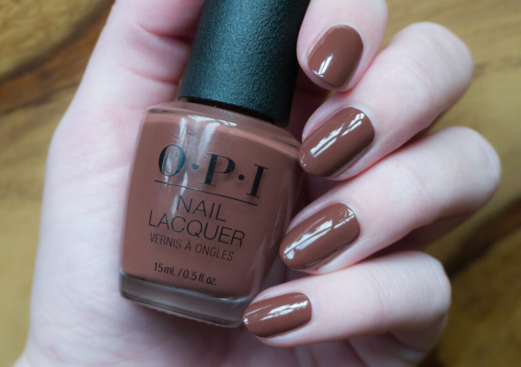
Espresso your inner self is a “deep espresso brown“. The shade covers perfectly in two coats. Apparently, ‘Espresso your inner self” is very similar to one of the browns in the ‘Malibu’ collection, so if you have that one, you might want to skip this one. Although I’m not that into browns, I do think Espresso your inner self has a good formula and looks awesome when paired with “My studio’s on spring”.
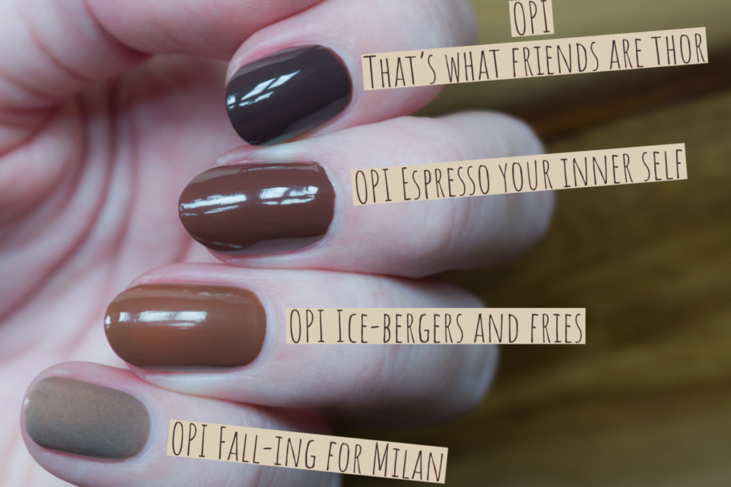
OPI Espresso your inner self is the color I hoped That’s what friends are Thor would be. OPI Ice-bergers and fries is a bit lighter and warmer than Espresso your inner self. OPI Fall-ing for Milan is just completely different with its gold shimmer.
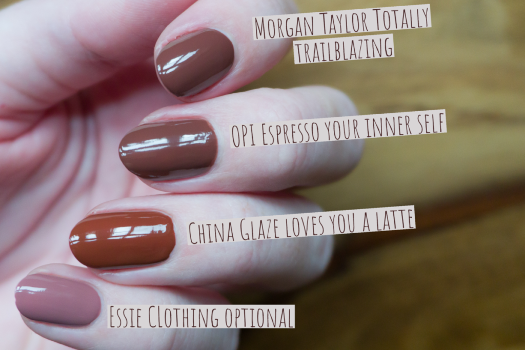
To be quite honest, all the shades in the picture above are awesome. Morgan Taylor Totally trailblazing is extremely close to Espresso your inner self, but it is a bit lighter than Espresso. China glaze loves you a latte is a bit warmer and Essie’s Clothing optional is just a lot lighter and contains more pink.
You can find Espresso your inner self over here on Amazon (affiliate link).
OPI My studio’s on spring
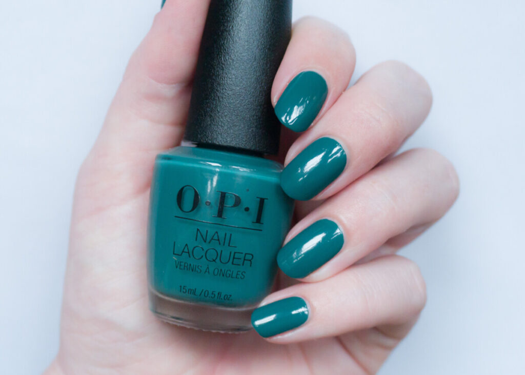
According to OPI “My studio’s on spring” is a lush, deep green. Based on all the pictures I had seen, I thought this would be a “Christmas tree green”. However, I’m happy to report that this shade leans teal. I personally find it super pretty, and it also has a very nice formula that was opaque in two coats!
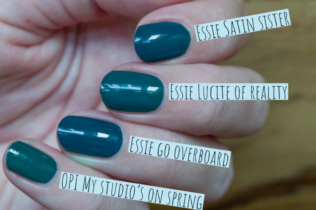
It always surprises me when two larger brands release almost the same color around the same time. Essie’s Lucite of reality and My studio’s on spring, are very close but not exactly the same. Essie’s Satin sister and Go overboard are too blue to be dupes for My studio’s on spring.
You ca find My studio’s on spring over here on Amazon (affiliate link).
OPI Isn’t it grand avenue
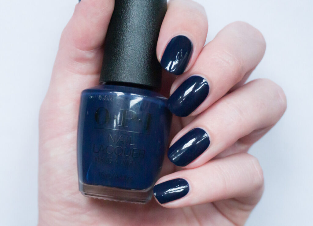
OPI says the following about ‘Isn’t it grand avenue‘: “channel museum nights with this intensely dark navy blue!”. ‘Isn’t it grand avenue’ is definitely very dark, it even dries darker than in the bottle. If you’re not in bright lighting, this shade will mostly look black. It did cover in two coats, and the formula was very easy to work with. It’s not my favorite of the collection, since I already have a lot of shades that are similar, but if you don’t have a dark navy blue yet, than “Isn’t it grand avenue” is definitely a good one!
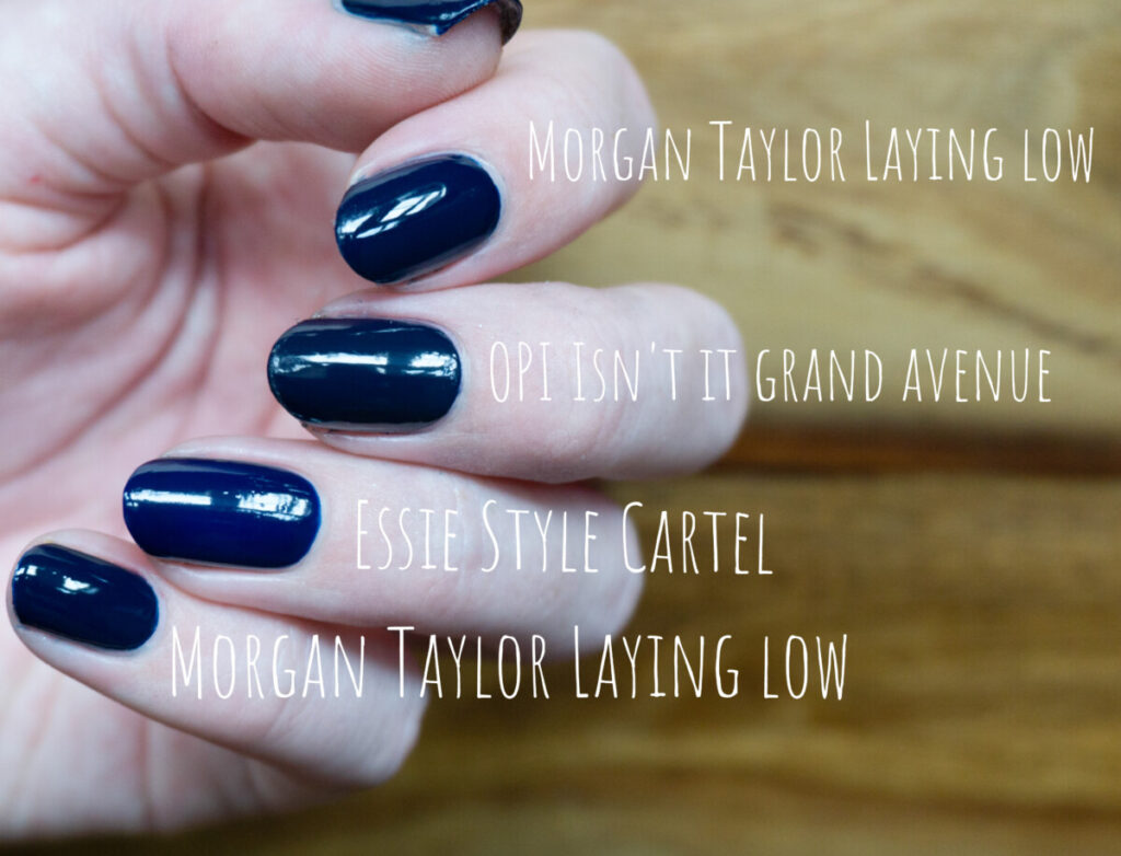
The closest I have is Morgan Taylor Laying low from the new fall 2021 collection. Laying low is slightly brighter while Isn’t it grand avenue is a bit more dusty. Essie’s Style Cartel is one of my favorite fall shades ever. It is definitely lighter than Isn’t it grand avenue. I kind of regret now that I didn’t pick up Essie’s “Infinity cool” from the Spring 2021 collection. It would have made an interesting comparison!
You can find OPI Isn’t it grand avenue over here on Amazon (affiliate link).
OPI Abstract after dark
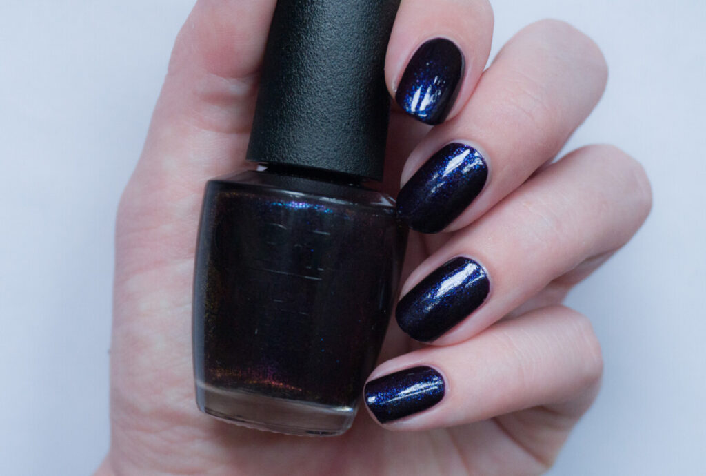
OPI labeled Abstract after dark as the “hero shade” of the collection. Abstract after dark is an updated version of Lincoln park after dark, which was a very dark plum first released in 2005. ‘Lincoln park after dark’ was apparently a huge hype back then, since it was one of the few vampy shades (says OPI). Abstract after dark has the same dark base but with added blue shimmer inspired by ‘the glittering nights of Los Angeles’ and ‘shimmering sparkle of sunset along the city skyline’.
This shade is indeed very pretty! I used two coats, but if you paint extremely thin you might have to use three coats. I would recommend using a topcoat with this shade, to bring out the sparkle even more (the shimmer ‘drowns’ a bit if you’re not wearing topcoat).
Abstract after dark reminds me a lot of another sparkly black I have in my collection: “Cosmo with a twist“. I will soon compare them side to side and add a comparison into this post! So far what I can tell: In the bottle, they look identical. If I paint both colors on a white piece of paper, I can see that the base of Abstract after dark is warmer, and the base of Cosmo with a twist is bluer. But is anyone going to notice the difference on the nail? Nope.
You can find Abstract after dark over here on Amazon (affiliate link).
Conclusion & Availability
Let’s be honest, I was totally biased since OPI Fall/Winter collections are always my favorite of the year. I was a tiny bit disappointed when I saw the promo pictures since the collection didn’t look like a typical fall collection. But now that I have seen and swatched them, I have fallen in love with this collection. It is the perfect mix of typical fall shades with light pastels. The collection indeed gives me the vibes that OPI wants me to get: artistic yet elegant. I’m pretty sure that I will wear all these shades a lot, even after this season.
The OPI Fall/Winter collection is already available in several stores. For example over here on Amazon (affiliate link), and over here on Beyond polish (affiliate link).
Disclosure: This post contains affiliate links, meaning that if you buy a product through one of these links, I might receive compensation at no additional cost to you. I label all affiliate links with the label “affiliate link”. As an Amazon affiliate, I earn from qualifying purchases.
Next to the full-size shades, I shared above, there is also a miniset available containing ‘Metallic composition’, ‘Abstract after dark’, ‘Art walk in Suzi’s shoes’, and ‘Espresso your inner self’. (You can find it over here on Amazon, affiliate link).
As I mentioned earlier, I purchased these shades through polishpick. PolishPick is based in the US, but also ships to selected countries outside North America. They are a lot cheaper than OPI stockists in Europe, so it is definitely worth checking them out. I simply contacted the owner through the contact form on the website and asked what the shipping rate was to the Netherlands. Shipping is based on the number of shades you want to purchase (but is not too expensive). My package with nail polish took 14 days to arrive at my doorstep, which is also not bad at all, considering it came from the other side of the world! I’m pretty impressed! You do have to take into account that you still have to pay a handling fee and taxes for shipping to the EU. In my case for PostNL I had to pay 4 euro handling fee plus 21% over the worth of the package. How much the handling fee is, depends on your final carrier. For example, for my Belgian readers that ship with Bpost, the handling fee is a bit higher.
These looks good and the 2 picks looks super. So it is holographic afterall!
Yes it is!!