Yes, again Picture Polish. I just couldn’t help myself. After a rainy and cold summer, the weather here finally started to be nice. So of course that was a sign that I needed to wear this summery color!
Picture Polish created Saltwater together with Gianna from Nailstorming. I didn’t know her yet, but of course I had to check out who was the great mind behind this polish. I really like her instagram account and I believe she’s also active on youtube.

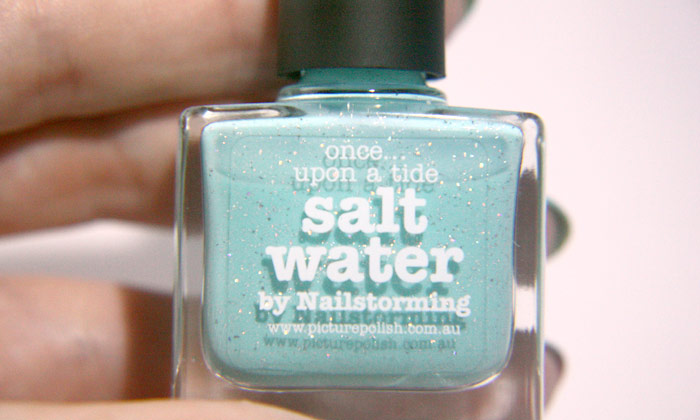
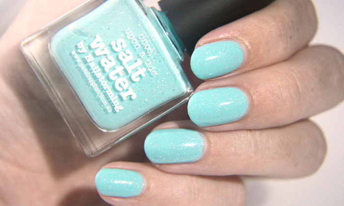
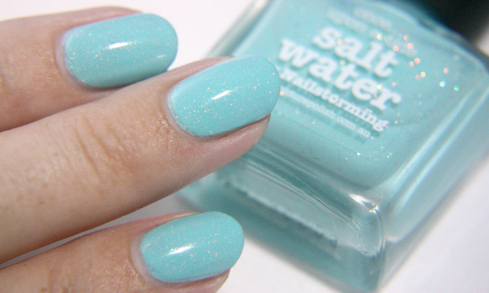
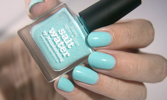
Picture Polish defines Saltwater as a turquoise nail polish. It definitely leans more blue than green, but when you keep it next to something blue, you can see that it’s not blue. I can’t believe that Picture Polish didn’t have such a shade yet before this color came out. The polish also contains tiny silver holographic flakes. As the pictures show, the particles are really holographic in the bottle. However, once I apply Saltwater, they just look like regular silver flakes. I literally haven’t seen a single holographic sparkle!

I have to admit that I still like this polish very much. Even if the flakes just look silver, it is still a pretty look and gives the polish something extra. The formula was OK, it was definitely not the easiest, but also not very hard. I find the consistency a little bit thinner than my other Picture Polish shades. I had to apply three thick coats to get it opaque. If I would have applied three thin coats I might have needed a fourth. Still, everything is forgiven since it’s such a pretty shade! But it might be something that you want to consider before you buy this polish.

Although Saltwater has some downsides, I’m in love with it. It gives me instant summer feelings when I look at my nails and it brings me back to some tropical island. You can buy Saltwater at different websites, but I have bought it from PrettyPolish.
What do you think? Is Saltwater worth a little trouble?


